In 2022, Acacium Group,the parent company of Hobson Prior acquired R&D Partners, a US-based life sciences staffing company specialising in placing highly skilled contractors in scientific and clinical research. The acquisition was intended to strengthen the group’s global position.
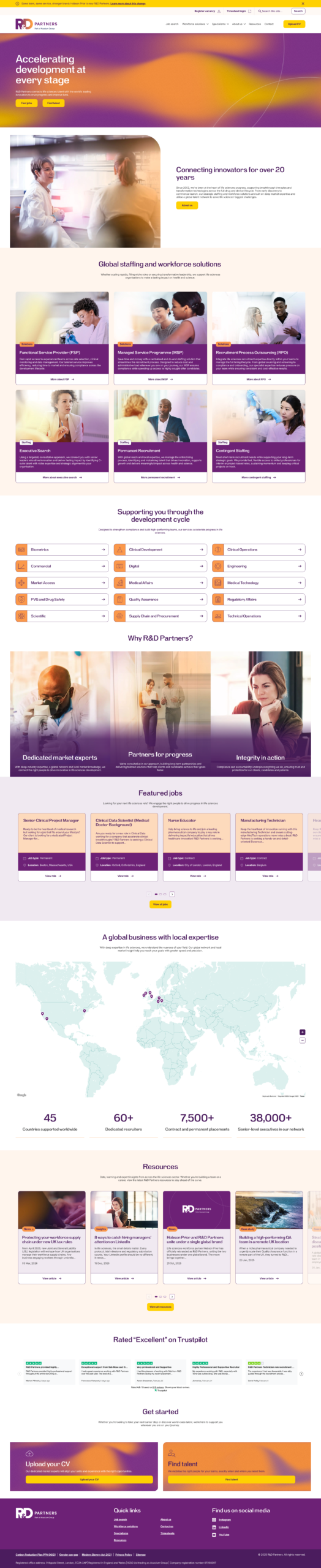
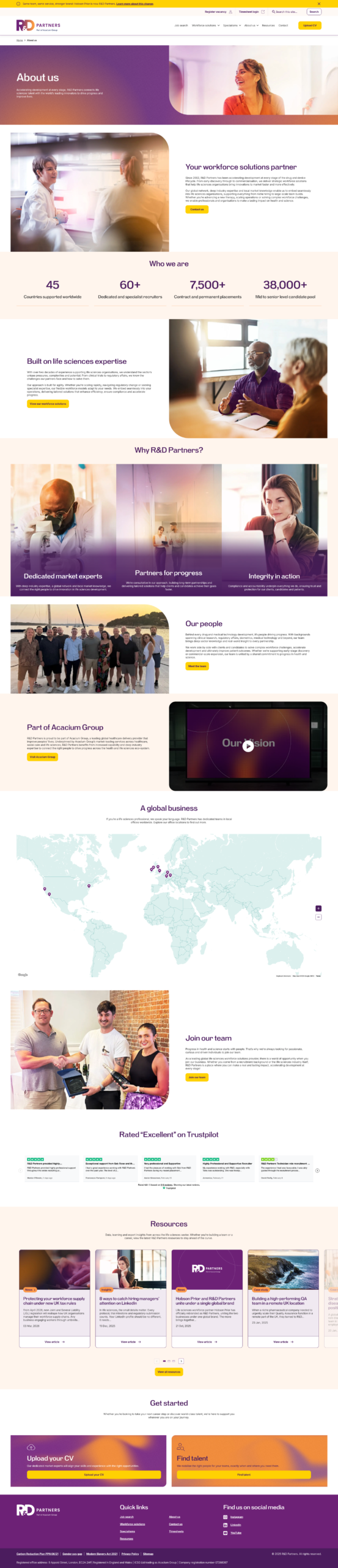
In October 2025, Hobson Prior officially rebranded as R&D Partners, bringing the two businesses under one global brand. By uniting under one brand, the combined organisation would offer clients simplified access to a wider global network. The key message to existing clients and candidates was simple: same team, same service, stronger brand.
Understanding the problem
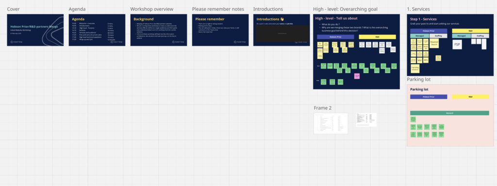
To establish a clear project vision, I facilitated a cross-functional workshop with senior brand stakeholders, UX team members, the marketing team, business analysts, and project managers. The session ran for ninety minutes and was conducted remotely via Microsoft Teams.
A key challenge throughout the project was coordinating across multiple time zones, spanning the US and Europe. To ensure full participation, the team agreed to flex outside of core working hours, and communication was kept deliberate and concise given the limited daily overlap available.
The workshop surfaced three primary objectives:
- Unify two established brands, one US-based and one European, under a single, cohesive identity.
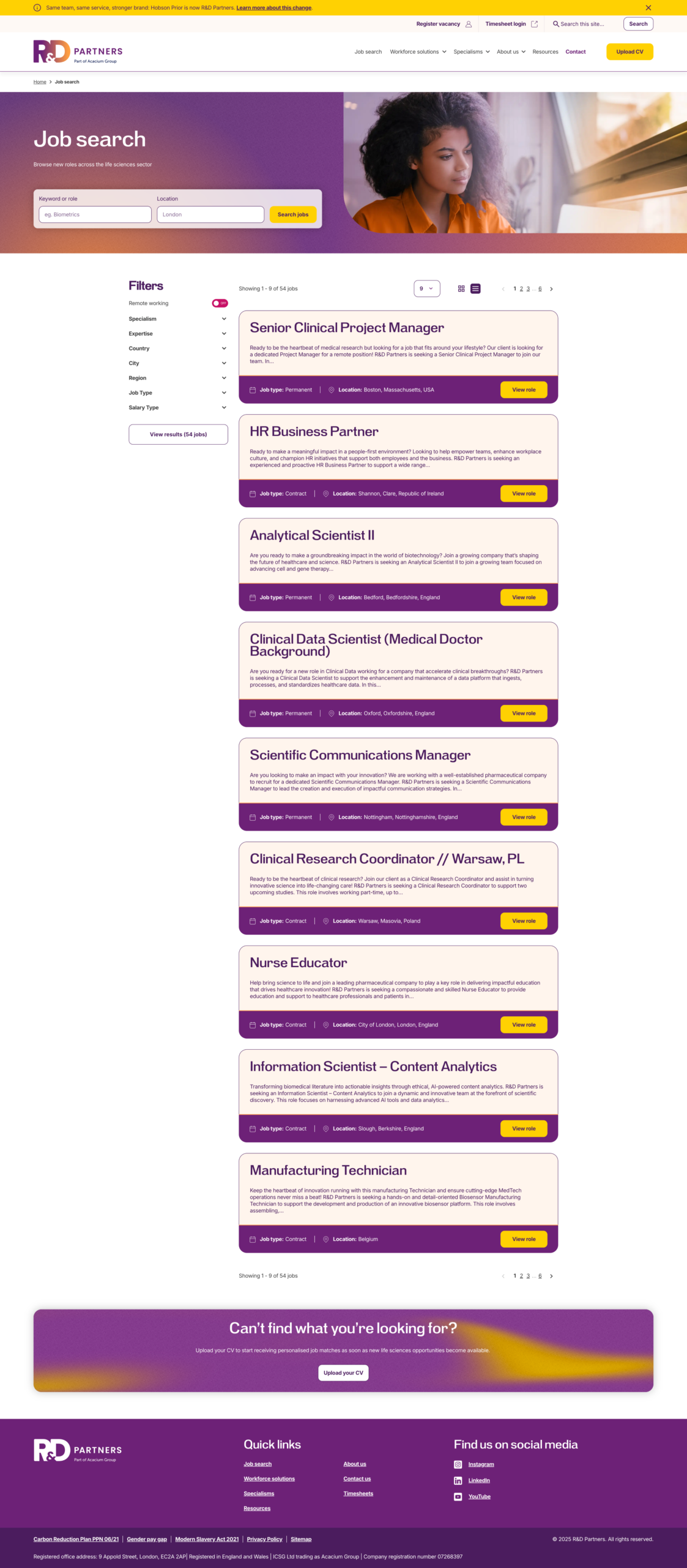
- Drive candidate engagement by encouraging applications and expressions of interest.
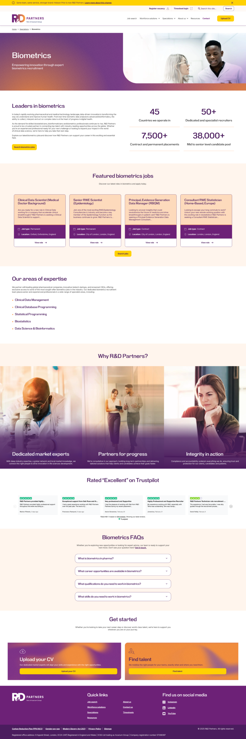
- Communicate the company’s value proposition clearly, enabling clients to quickly understand what the business does, why it exists, and how to engage with it.
UX research and competitor analysis
I initiated the research phase by analysing competitors identified during the workshop. Screenshots of key pages from each site were captured and collated on a Miro board, enabling me to annotate specific areas of interest with observations and insights.
A consistent pattern emerged across the competitor landscape: the majority of sites appeared to lack UX expertise, resulting in poor navigation, buried content, and an overall lack of visual hierarchy. Colour palettes were largely muted and uninspired, and imagery was heavily reliant on generic stock photos, doing little to differentiate the brands or engage the user.
Audit of current websites
In order to understand how the brands worked, I took some time to audit the current websites.
I used Google Analytics alongside Microsoft Clarity to get stats on essential pages and how they were performing.
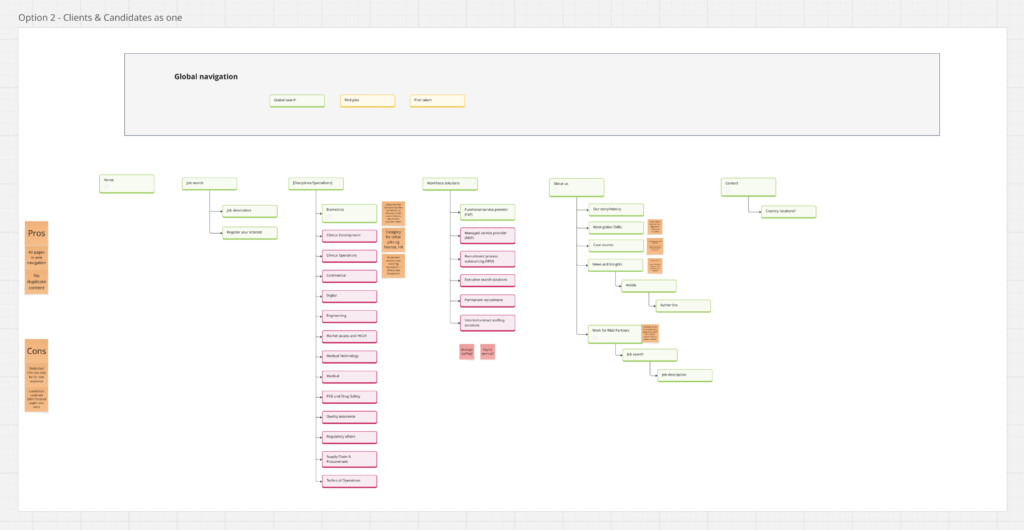
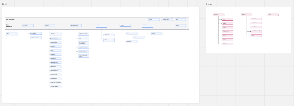
Information architecture
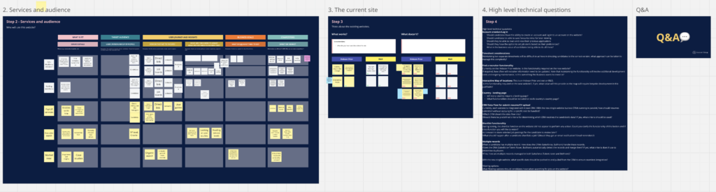
To plan out the IA, I began by referring to the stakeholder workshop. This allowed me to understand the key pages that were discussed and what pages are essential.
We also pulled sitemaps from the two existing sites, in order to map out all pages and understand if there were areas that were covered by both sites, that could be merged into one page/section.
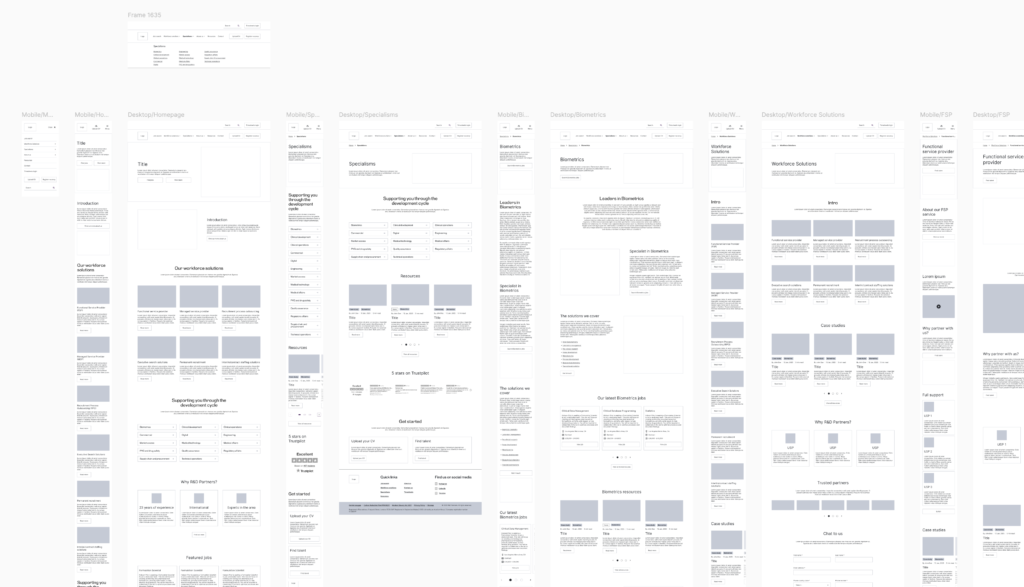
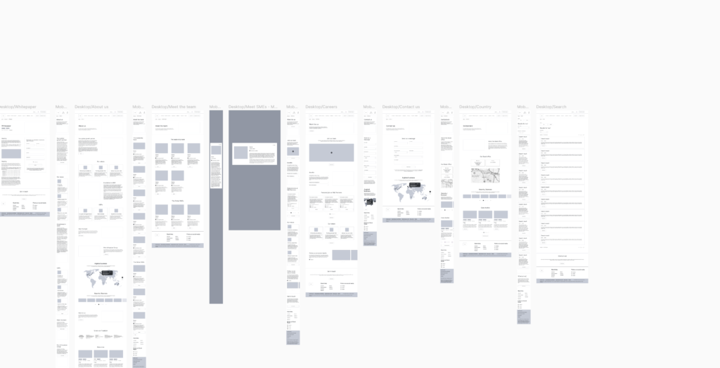
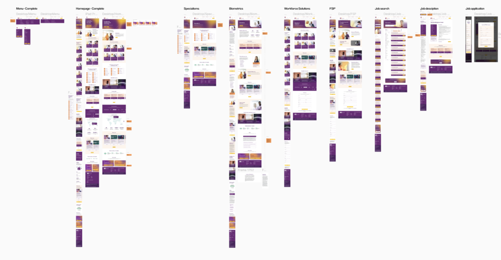
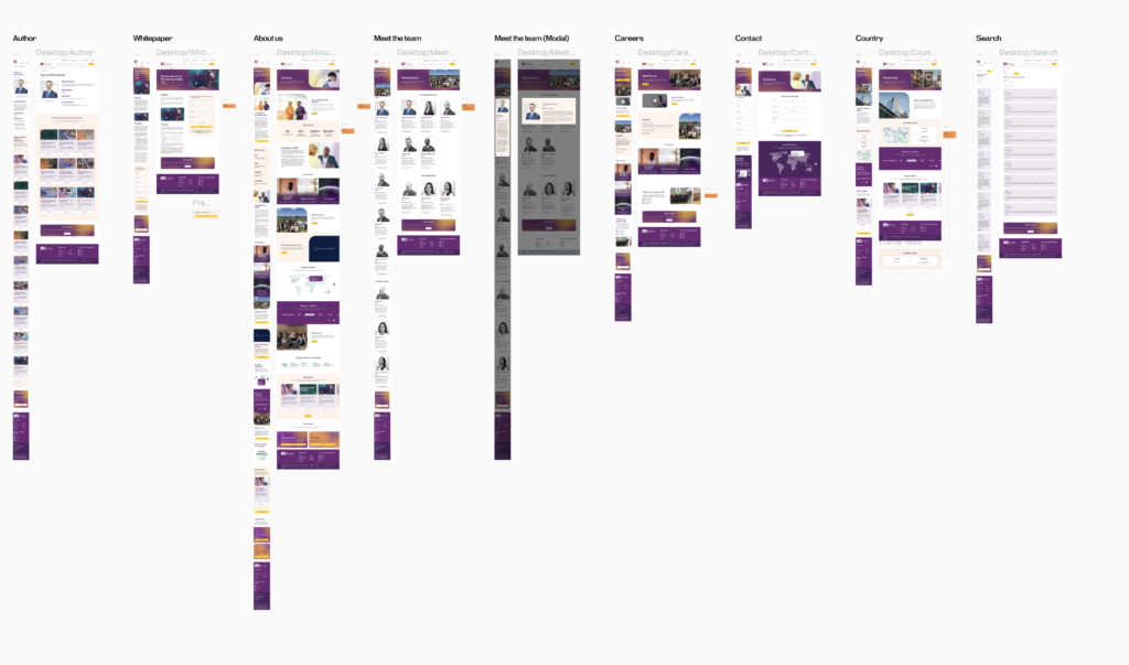
Wireframes
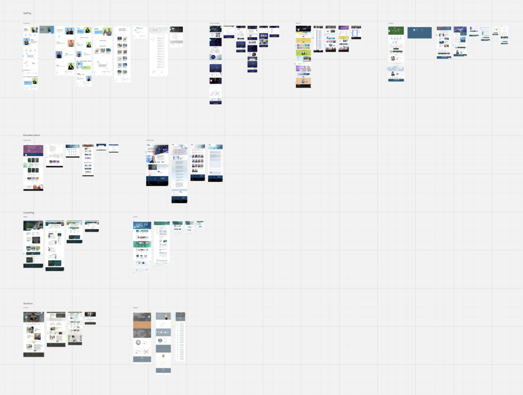
I began the wireframes using Figma as the main platform. The wireframes were created with a mobile first approach, using basic blocks in greyscale to get the feel of how each page would flow.
The wireframes were presented back, firstly to the smaller marketing team for initial feedback, then to the wider group for further feedback.
As part of the wireframe stage, there were questions that had still been unanswered. Being able to present a visual allowed the group to make swift decisions.
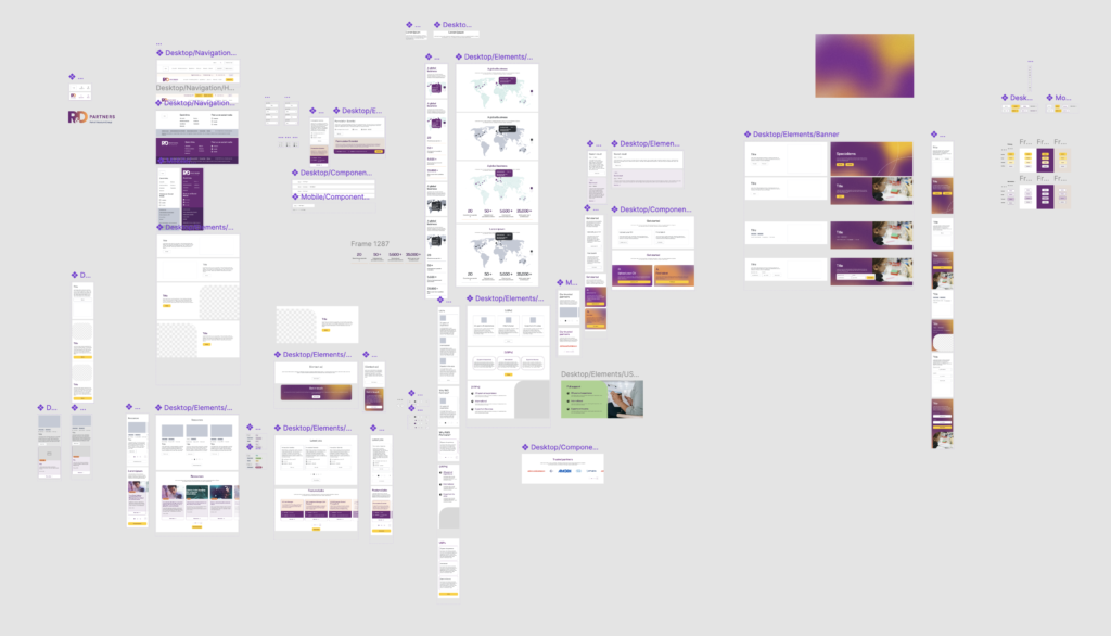
High Fidelity
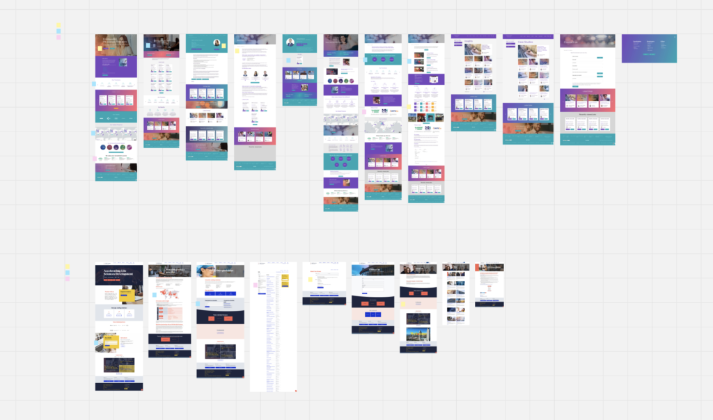
To develop the high-fidelity designs, I collaborated closely with the project’s graphic designer to align on colour, typography, imagery, and illustration style. The chosen colour palette was selected in accordance with WCAG 2.1 accessibility guidelines, ensuring a minimum AA compliance standard was maintained throughout.
The high-fidelity designs were presented to stakeholders across two structured review sessions, during which I walked through the designs and gathered feedback on the overall look and feel. Designs were delivered within an interactive prototype, helping less technically-minded stakeholders better visualise the intended end experience.
One notable challenge arose around project timelines. A miscommunication within the business revealed that the actual deadline was a week earlier than the team had originally been briefed. This came to light during the first high-fidelity review session, prompting a swift reprioritisation of the remaining workload to ensure delivery was completed on time and to the expected standard.
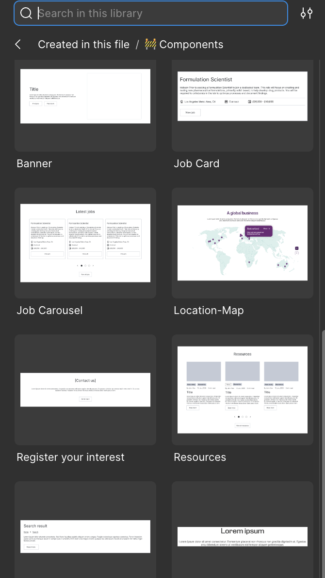
Component Library
Whilst creating the designs, I made sure to keep an update to date component library, where I could build out the key sections and assets to make designs quicker and easier. These were always maintained, making sure that any components on the pages were a component that could be reused in the CMS if needed.
The components were created for both wireframes and high fidelity designs.
Handover
Once the designs were ready and signed off, we presented the designs to our development agency. This included running through each page and explaining how we envisioned the page to look and work. It also allowed us to understand any major issues that may have been missed during earlier discussions.
Overall, the handover was a smooth process. We made sure to keep in the loop with the agency for any issues that crept up through Monday.com and were there to provide support where needed.
Release
The website went live in October 2025. I made sure to monitor the site and report any issues that cropped up over the first couple of weeks.
The website had amazing feedback, with senior members of the business praising the work put into the site, along with the new visuals that would make it stand out from competitors. The ease and simplicity of the website had also started discussions into potentially redesigning one of the other brands in the company.
Lessons Learnt
- It is always good to double check deadlines as they can be miscommunicated, leading to stress and rushing.
- Due to our team dropping from 9 to 2 UX designers, we should’ve given ourselves more time to pick up the small extra tasks that would’ve been picked up by someone else.
Gallery